Posts

GIS Programming: Debugging and Error Handling
Image
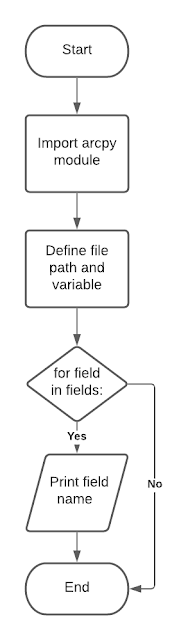
"At the source of every error which is blamed on the computer you will find at least two human errors,  including the error of blaming it on the computer." ~Anonymous The art of debugging is arguably one of the most important skills for any programmer. Procedures for debugging include:  Reviewing error messages  Inserting print messages at select locations within the script Commenting out lines or sections of code Using a debugger  Our task for this week's lab was to debug two pre-written scripts using some of the above procedures and add a try-except statement to a third script to catch the error.  Script 1 Script one contained two errors and/or exceptions that needed to be fixed in order for the script to run. Once fixed, the script printed out the names of all fields within the parks.shp attribute table.  Flowchart for Script 1. Script 1 output.  Script 2 Script 2 contained several errors/exceptions that needed to be corrected in order for the scri...

GIS Programming: Python Fundamentals

Image
This week's lab provided a solid introduction to the fundamentals of programming in Python, working within an IDE, and setting up file paths to manage data and outputs for the remainder of the course. In Step 1 of the lab, we learned how to work with strings and lists by splitting our full name into a list of strings. We then used indexing to print our last name, the last item in the list. In Step 2, we learned some of the basics of debugging by fixing two errors in a prewritten dice game program. Steps 3 and 4 had us create a list of 20 random numbers and then remove a chosen integer from the list.  The screenshot below shows my outputs for these steps. 

Google Earth: Tour of South Florida

Image
Google Earth is a great way to share geospatial data with users who may not have the knowledge base or software to otherwise access GIS data. In this lab, we learned how to convert shapefiles and feature classes into .kml files within ArcGIS pro so that these files can be easily added to Google Earth. We also learned how to create and share a virtual tour within Google Earth.   The map below was created in Google Earth and shows water features and population densities of South Florida. The data was first converted to the .kml format in ArcGIS Pro and then added to Google Earth. The legend was added as an image overlay.  The video below shows the virtual tour I created within Google Earth highlighting several metropolitan areas in South Florida. 

Isarithmic Mapping: Annual Precipitation in Washington State

Image
The second most common type of thematic map behind the choropleth map is the isarithmic map. While choropleth maps are great for mapping phenomena existing within hard boundary lines, also known as enumeration units, isarithmic maps are perfect for mapping continuous data such as temperature, precipitation, or elevation. In isarithmic mapping, contour lines are frequently used to connect locations with equal values. Hypsometric tints can then be added to color the areas between contour lines with different shades so that map readers can easily distinguish between areas with high and low values.  In this lab, our task was to create an isarithmic map showing average annual rainfall in Washington State. This rainfall data was interpolated using the PRISM (Parameter-elevation Regressions on Independent Slopes Model) method developed by Oregon State University. The map below was created using ArcGIS Pro. Areas with low precipitation (less than 10 in/yr) are shown in red, and areas with ...

Choropleth Maps and Graduated Symbols: Wine Consumption in Europe

Image
Choropleth maps show concentrations of many different types of phenomena using graduated colors or patterned symbology and are among the most prominent types of thematic maps. Graduated symbols use variable symbol sizes to represent different value classes of a particular dataset. In this lab, our task was to create a choropleth map comparing population density of European countries and then use either proportional or graduated symbols to represent the annual wine consumption per capita of these countries.   This map was created using ArcGIS Pro. I chose to display both the population density and wine consumption data using the Natural Breaks classification method because the data distributions for both these datasets are skewed heavily to the right. The Natural Breaks method minimizes within-class variance and maximizes between class differences. I also chose graduated symbols over proportional symbols because I think this map is easier to read when the data is classed. Symbo...

Data Classification Methods: Senior Citizens in Miami-Dade County

Image
There are six common data classification methods used when creating thematic maps. Each of these methods has advantages and disadvantages, and whichever method the map creator chooses can lead to significant differences in the map output. If an inappropriate classification method is selected, maps will be inaccurate at best and could potentially be outright misleading.  In this lab, we used 2010 census data from Miami-Dade County to compare and contrast four of the six most common data classification methods: Equal Interval, Quantile, Standard Deviation, and Natural Breaks. The first map shows the percentage of senior citizens by census tract using these four methods, and the second map shows the normalized count of senior citizens per census tract. 

Ward 7 Public Schools in Washington, D.C.

Image
  Gestalt's Principles present a theory of how humans perceive and organize components of complex graphical images. In this lab, we were asked to effectively leverage Gestalt's Principles while designing a map of public schools in Ward 7 of Washington, D.C. Concepts which emerge from Gestalt's Principles, such as visual hierarchy, contrast, figure-ground, and balance, were also used as a framework for our map design.  Visual Hierarchy  This map was created using ArcGIS Pro. One example of visual hierarchy in my map is the use of vibrant colors to emphasize thematic symbols (i.e., schools) and the use of dull, pale colors for my base information. I also used increased font sizes to emphasize important map elements, such as the title and subtitle.  Contrast I used contrast in size and color to easily differentiate symbols for elementary schools, middle schools, and high schools. I also used a drop shadow effect around the Washington, D.C. boundary in both the primary m...